Slate Team

Most social teams care about the small details more than anyone realizes. Not because they’re precious about typography, but because those details add up. When you’re creating assets for multiple platforms, series, and campaigns, the difference between “on brand” and “almost” usually comes down to text styling.
The problem is that styling takes time. And for most tools, a “brand kit” starts and ends with fonts and colors. That doesn’t help when your IG Story announcements look different from your creator series titles, or when your team switches between boxed text on TikTok and clean, unboxed headlines for LinkedIn.
Text Presets were built to solve that exact gap.
What Text Presets Actually Do
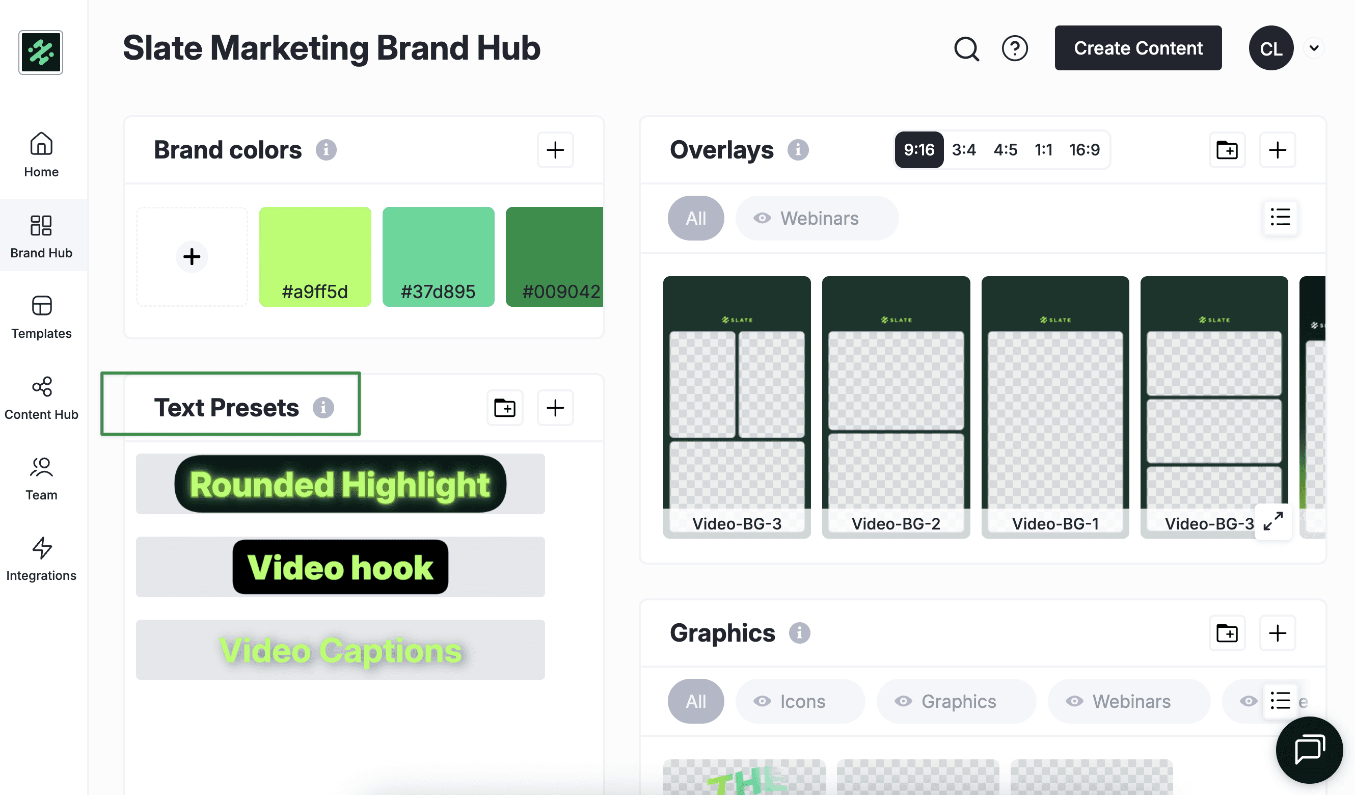
A preset saves the full styling of a text element—not just the font or color, but the look as it’s meant to appear in your content. If your team uses a bold, yellow background box for episodic titles, you can save that once. Same for subtitles, story headers, creator callouts, and anything else you need to repeat across formats.
The benefit is simple: instead of rebuilding these styles every time, you apply them with one click. It keeps the output consistent no matter who’s editing.
Why This Matters for How Social Teams Work
Most teams don’t create with one universal style. They juggle different formats depending on the platform or the project. For example:
Story announcements
Ongoing episodic titles
Game day or event callouts
TikTok subtitles
Creator collaboration formats
These aren’t edge cases — they’re weekly work. Presets let you store each style as its own reusable option so the team can move between them quickly without recreating the look from memory.

Consistency Without Extra Steps
From a CMO’s perspective, this is less about saving seconds and more about removing places where teams drift off-brand. When styling is handled manually, the differences show up over time — slightly different padding, a shade off on the background box, text that’s aligned a little differently. None of it is intentional. It’s just the result of moving fast.
Presets turn those variables into fixed decisions. The team doesn’t need to think about them. They’re applied the same way, every time.
A Quick Example of How This Plays Out
Imagine your team is launching a new Instagram Reels series where you introduce different guests. Each Reel uses the same title style—heavy weight text with a bright highlight treatment that stands out against any background.
Normally, someone would have to recreate that styling every time, or dig through old projects to copy it over. With text presets, you save the style once and your team can apply it instantly to every new guest intro.
Where This Fits Into Your Workflow
It keeps output consistent across teammates.
Makes brand expression clearer without adding new rules.
Reduces review and correction cycles.
Helps teams produce more without the usual styling drift.
It’s not meant to replace creativity. It’s meant to remove the repetitive parts so you can put that energy toward something better than resizing text boxes.
Text Presets are now available in Slate. Build your styles once, and keep them steady across everything your team publishes.